Howdy, Stranger!
It looks like you're new here. If you want to get involved, click one of these buttons!
Categories
- 996 All Categories
- 3 Picture Posting and Resizing
- 58 New Member Introductions
- 120 Off-Topic Forum
- 4 Photography
- 2 Resources
- 18 New Product Information
- 170 The SierraWest Forum
- 10 Brett's Blog
- 121 General News & Ramblings
- 3 Re-Release Information
- 6 Q & A about SierraWest
- 9 What Would You Like to See?
- 408 Builds
- 145 HO Scale Builds
- 180 O Scale Builds
- 62 Finished SW Build Pics
- 15 Miscellaneous Builds
- 195 Techniques
- 19 Working with Wood
- 23 Painting Castings
- 5 Masonry
- 23 Scenery
- 37 Tools and Supplies
- 22 Layout Planning & Building
- 40 Miscellaneous
- 24 Prototype Information
- 22 Reference and Research
My First Foundry
My first post on the forum so please excuse any errors or struggles with the format. Also "My First Foundry" would be a great name for Brett's first children's book if he ever wants to branch out.
I started on the JE Morton's Brass and Iron Foundry around June 1st. Summer modeling always takes a bit longer but have been making good progress.
As you can hopefully see in the photos, I kept both a copy of the manual along with Ken Karn's masterful forum build under my pillow. I tried to execute some of the "extra" techniques that Ken displayed to the best of my abilities as I find these challenges help to make me a better and more experienced modeler. Not sure how many pics I can add per post so may have to split the first three buildings up into multiple posts. Any constructive criticism or tips are greatly appreciated.

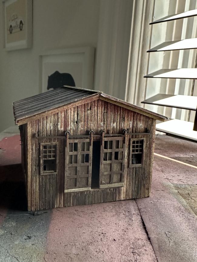
The rear of the Blacksmith shop. Will try to tone down the weathering under the windows before installation. It reads a little darker than it looks in person. One of the kickplates for the doors was lost the Vacuum Monster so the left one was fashioned from scrap. I went with a Tuscan Red acrylic mixed with some umber for the wood coloring as the SW set is no longer available. It was VERY bright when applied but dulled down very nicely with some chalk and AI weathering.
I started on the JE Morton's Brass and Iron Foundry around June 1st. Summer modeling always takes a bit longer but have been making good progress.
As you can hopefully see in the photos, I kept both a copy of the manual along with Ken Karn's masterful forum build under my pillow. I tried to execute some of the "extra" techniques that Ken displayed to the best of my abilities as I find these challenges help to make me a better and more experienced modeler. Not sure how many pics I can add per post so may have to split the first three buildings up into multiple posts. Any constructive criticism or tips are greatly appreciated.

The rear of the Blacksmith shop. Will try to tone down the weathering under the windows before installation. It reads a little darker than it looks in person. One of the kickplates for the doors was lost the Vacuum Monster so the left one was fashioned from scrap. I went with a Tuscan Red acrylic mixed with some umber for the wood coloring as the SW set is no longer available. It was VERY bright when applied but dulled down very nicely with some chalk and AI weathering.

Comments
And the "front". Note the roof and wall damage. The damage on the roof needs to be worked on, looks too unnatural.
The right and final side with some things hanging off the wall.
Front view with porch and damaged area on the porch roof. Again, need to work on this but I want to wait until it's all together to see how it looks. I have no idea how Ken made his damage look so natural but you learn by doing!
Side view with that super cool sign that I weathered pretty heavily.
Hey, thanks Jim! I agree on the shingles. Took these photos at an odd angle and had to play with them to get them to post but I’ll do a double check in person.
I love the rotting and weathered wood. It is something I struggle with mainly due to my OCD and being a furniture/cabinet maker where everything must be perfect.
I have hell forcing myself to get the excellent results you are showing here.
Well done!!
This is going to be a great thread to follow.
I love what you've done so far. Great grungy look.
We're all here following along.
Way too heavy handed with the white chalk/water damage. Every time I walk past, I rub a bit off or add some straight alcohol to tone it down. I am worried about applying too much alcohol at one time as the roof paper already wants to come up. Do love the look though more subtle will be better.
Pretty happy with this side. Will add some more weathering when I start to place the details. Note all the stacks are just staged at this point and being held on with a small piece of modeling clay so I can get a good idea of the sight lines. As mentioned, I am a big clumsy oaf.
Reasonably happy with this side as well. Have to tighten up the edges of the roof on the Pattern Shop. The card isn't warped but I don't think I glued the edges well enough. The Tempering Oven was so much fun to weather and I love the pipe detail. Will try to get a better pic. Also in regards to the shingles on the Repair shop, I did mess up and put the "kicker" row too far back. Trying to adjust without tearing the roof up if anyone has any ideas.
Again, reasonably happy with this side and will adjust weathering once the dock and details are added.
Overhead shot. What a gosh-darn beautifully designed kit and not even 1/4 of the way done!
And what a fine job your doing with it! Can't wait for the next post.
Jerry
Very nicely done.
Ham handed my butt, seems to me like you are doing just fine, and then some.
great job........carl.......
I have spent the last week or so adding the color to the walls. Seen below was the first go. I've since gone back and reworked them a bit and dulled some of the louder shades down. Working with chalk for coloring is a lot easier than paint, I've found. So much easier to go back with a little chalk or alcohol to adjust. Hoping to add the windows and put up the walls in the next week or so.