Howdy, Stranger!
It looks like you're new here. If you want to get involved, click one of these buttons!
Categories
- 954 All Categories
- 3 Picture Posting and Resizing
- 60 New Member Introductions
- 100 Off-Topic Forum
- 2 Photography
- 2 Resources
- 18 New Product Information
- 164 The SierraWest Forum
- 11 Brett's Blog
- 120 General News & Ramblings
- 3 Re-Release Information
- 1 Q & A about SierraWest
- 9 What Would You Like to See?
- 405 Builds
- 145 HO Scale Builds
- 185 O Scale Builds
- 58 Finished SW Build Pics
- 11 Miscellaneous Builds
- 185 Techniques
- 19 Working with Wood
- 23 Painting Castings
- 4 Masonry
- 16 Scenery
- 37 Tools and Supplies
- 22 Layout Planning & Building
- 38 Miscellaneous
- 19 Prototype Information
- 18 Reference and Research
Stump Creek Lumber Tool Shed
I was so excited to see Brett's new O Scale kit, the Water Tank & Handcar Maintenance sheds, that I immediately got one on order. While I was waiting for Brett to complete and ship the kit, I decided to finally start on my unbuilt Sierra West Tool Shed. It looked like the perfect structure to sit on the tracks next to the water tank. I've cut a base to fit both structures and got started on the Tool Shed.
I want to use the Tool Shed to show off some of Brett's new 3D printed details that I have on order so I modified the front wall to use two of the large sliding door from the side wall. I will leave these in the open position so that I can detail the interior and use a couple of LED lamps.
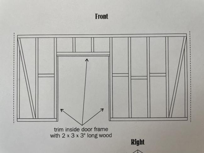
I cut out the existing studs and replaced them with a header and relocated studs.
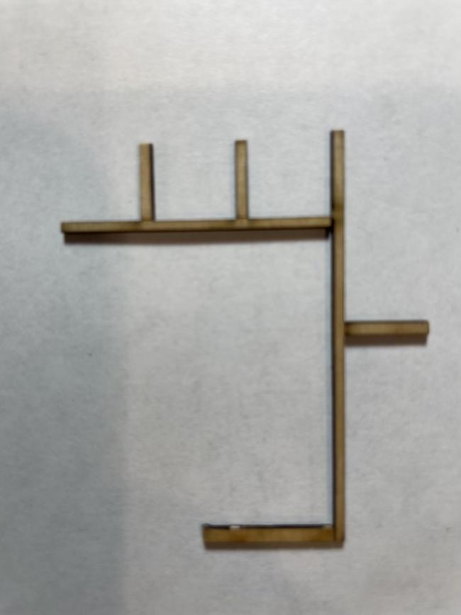
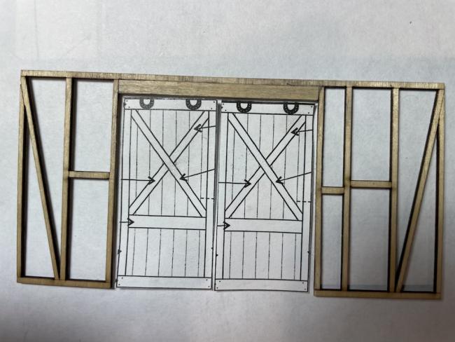
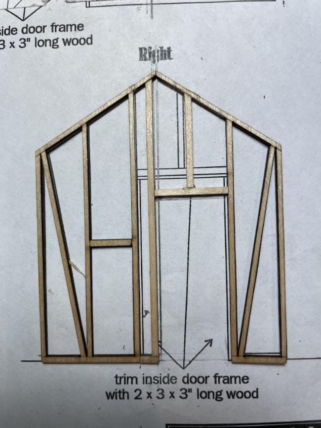
I modified the side wall to replace the relocated sliding door with a man door.
I used Brett's technique for weathering strip wood by scribing grain, adding nail holes and using pastel chalks. I won't go into the detail as it has been described previously in the forum.
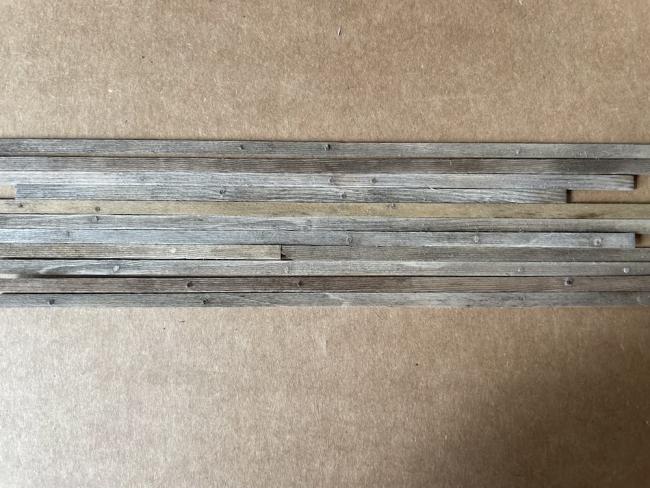
I utilized Brett's damp brushing technique to add a white peeled paint to the structure.The white doesn't
t show as well in the picture as it does on the strip wood.
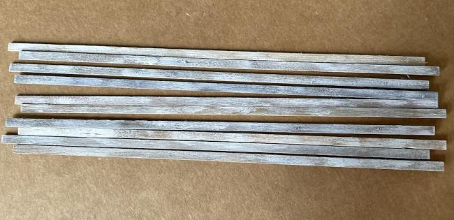
I want to use the Tool Shed to show off some of Brett's new 3D printed details that I have on order so I modified the front wall to use two of the large sliding door from the side wall. I will leave these in the open position so that I can detail the interior and use a couple of LED lamps.

I cut out the existing studs and replaced them with a header and relocated studs.


I modified the side wall to replace the relocated sliding door with a man door.

I used Brett's technique for weathering strip wood by scribing grain, adding nail holes and using pastel chalks. I won't go into the detail as it has been described previously in the forum.

I utilized Brett's damp brushing technique to add a white peeled paint to the structure.The white doesn't
t show as well in the picture as it does on the strip wood.


Comments
Looking forward to following along on this one.
Terry
I finished getting the siding on the other three walls. After looking at the pictures, I see I have a bit of fuzz to clean up and a few more nail holes and cracks to add. I'll get that done next then its on to the windows and doors.
I decided to include a picture of the inside of the walls. Brett's laser cut framing is one of the many features that makes Sierra West Models the best and most detailed models. I can't wait to get these walls filled with both new and old Sierra West castings.
Thank you, brownbr, Ken and Tom for the positive comments. I really appreciate the feedback.
I was hoping to get the two side walls complete tonight but life got in the way. I did get one wall completed and at least assembled the door for the other side wall so I thought I would post those to keep this build moving.
Ken - that is an interesting thought on the lower window mullions. The lower sash as provided in the kit does not have mullions. However, that could add a bit more detail to the window. I'm going to investigate adding some strip wood mullions. Interesting idea!
I lived id a house built in 1740 amd a add on in 1860 the windows in the older part of the house were 12 over 12 top and bottom the newer pari had 8 over 8 just on the top so with that being said the one pice of glass was expensive but that was very popular at the time....Carl........
The top sash was 8over8 the bottom sash was one sheet of glass just like the windows in this kit.
Terry
You could use some grey and white chalk (depending on the underlying board) on a fine detail brush on the edges of the streaks to blend/fade the edges into the boards and thus reduce their size and contrast.
Nice work so far.
I also notched the platform and added a staircase and railing.
Now that I have a plan, I'll get back to finishing the tool shed and the surrounding details.