Howdy, Stranger!
It looks like you're new here. If you want to get involved, click one of these buttons!
Categories
- 954 All Categories
- 3 Picture Posting and Resizing
- 60 New Member Introductions
- 100 Off-Topic Forum
- 2 Photography
- 2 Resources
- 18 New Product Information
- 164 The SierraWest Forum
- 11 Brett's Blog
- 120 General News & Ramblings
- 3 Re-Release Information
- 1 Q & A about SierraWest
- 9 What Would You Like to See?
- 405 Builds
- 145 HO Scale Builds
- 185 O Scale Builds
- 58 Finished SW Build Pics
- 11 Miscellaneous Builds
- 185 Techniques
- 19 Working with Wood
- 23 Painting Castings
- 4 Masonry
- 16 Scenery
- 37 Tools and Supplies
- 22 Layout Planning & Building
- 38 Miscellaneous
- 19 Prototype Information
- 18 Reference and Research
The Main Street Hotel #206 - in O Scale. Karl.A
I started this build in Jan 2012 and then shelved it at 50% complete in Oct 2012, gathering dust ever since.
Along with my MainStreet Warehouse build. Now finished.
http://www.craftsmankituniversity.com/vanforum/index.php?p=/discussion/1268/the-main-street-warehouse-206-in-o-scale-karl-a/p1
I shelved the Hotel project due to other modeling commitments and because I wasn't happy with any font I could find for the dry goods store front wall or the gas pump scene I was creating.
So, this seems like a good candidate for my "finishing off old projects and easing back in to things" phase.
Many of you will have seen the previous progress on this build so I'll just post a brief recap of how it got to where it is now for those who aren't aware of the build so that way I don't bore too many of you, hopefully.
I'll post a few old progress here while I finish off BlueSky and then pick this one up and finish it off.
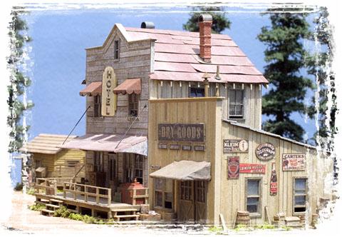
Brett's beautiful HO kit.


Comments
Jerry
A couple of hurdles but after eight years of looking at it you'd think I'd have it figure out by now, we'll see.
talking of personal touches Rick, the next couple of posts will hopefully interest you, and also a few of the other readers.
I've never posted them before and had forgotten all about these things I did myself.
Here's what I found...
I grabbed a clean, soft, 1/2" wide brush and set to work on the clean up. Luckily in my exuberance I only knocked off a few things, easily fixed, so thats all good.
While dusting the front wall I started noticing some subtle things...
I remembered I had torn the small upper/top awning as a reason for rain water to pour down and concentrate on the lower awning, thus giving me a reason to distress that lower awning much more heavily on the corner.
But, I noticed the way the upper awnings were laying, their shape and conformity and I couldn't remember how I had done it, I built this almost 10years ago dont forget, so, things get hazy, lol.
Here is a pretty good shot of what I'm looking at, and talking about.
So, I turned the building over to have a look from underneath to see what I had originally done and figure out what was going on and what I was looking at.
Here's what I found...
edit: I was scrutinising that last picture and just realised that I did add nailheads, theyre tiny, but once you start seeing them you'll notice them... I guess, like they should be...
so underneath I saw that the dock was fully built, corners braced, pretty cool but standard stuff, so looked closer...
Things I noticed were... I had done the peeling paint effect up under the roof overhang on the soffit, like it should be,
the main porch roof was only partly boarded where it was exposed, a standard old trick I used to use alot years ago.
The window awnings were fully framed as per reality (probably built with styrene but, I didnt wiggle them to find out) and I had used thin wrapping tissue paper as the fabric. I had colored both sides.
The thin material was conforming to the frame and that was what was giving the effect from the outside and the dimensionality. The frame shape showing through the fabric was a pretty good look I thought.
Karl.A
I apparently used to be quite good at this stuff back when I was doing it... hahaha,
I keep looking at my old models during this period and thinking "how the 'H...' did I do that...
Mike, I just spent an hour or so looking for your build to get ideas from it and some pointers, I read through MikeC's and Elliots build of this 'beast'...
Did you do a thread 'over there' ? I found a few pics of your build in MikeC's thread but nothing else.
As for me, I'm finding O scale details to replicate Bretts HO original masterpiece as close as possible, and some extra's to blend in to fill in those spaces that always appear when you do an upscale, but trying to keep it authentic looking...
I'll post some pics later while I play around with placements, I'm kinda struggling because it's not the usual industrial scene that I'm used to... lol,
I can't just throw a junk scene around to take up space when I'm building a hotel... hahaha
and then it FINALLY dawned on me... the way to get some of those awesome details into the scene wasn't a junk pile... it was a 'new pile'.
The merchandise from the dry goods store cluttered outside for sale, on display to attract those customers, gold miners, farmers, homesteaders...
Just your basic old style hardware general goods store, serving the prospector community and a growing backwoods town with everything they needed to build America.
Gonna be a little strange not to have everything, old, worn, aged and rusty... nothing wrong with that though, a change is as good as a rest.
One of my main stopping points on this build, as I noted earlier was the signage for the dry goods store. It's a very visible and focal point of the model.
Sometimes things just go wrong, or don't go right, this time I'm gonna keep trying till I get 'it'.
The top sign is crooked (my first try), the bottom one isn't touched/weathered at all yet, I'm liking the third one, but, still not what's in my minds eye. I'll keep trying.
I am liking how the barrels are turning out though so far, newer and not so aged as I usually do.
(I weathered the barrel with trash in it as older than the others for difference and to show it was aged more than the rest and had been around for a while.)
I'm between 2 and 3 myself Alex, they look different against the model though due to lighting when they are in the vertical position as opposed to flat on the desk. I'll do a couple more today and pick one and move on.
Great comment Alan, indeed matching the age of the wall is paramount, the hotel is very weathered but matching to the much newer store is where I'm at.
" perspicacity" is a great word, thanks for the compliment.
More later.