Howdy, Stranger!
It looks like you're new here. If you want to get involved, click one of these buttons!
Categories
- 954 All Categories
- 3 Picture Posting and Resizing
- 60 New Member Introductions
- 100 Off-Topic Forum
- 2 Photography
- 2 Resources
- 18 New Product Information
- 164 The SierraWest Forum
- 11 Brett's Blog
- 120 General News & Ramblings
- 3 Re-Release Information
- 1 Q & A about SierraWest
- 9 What Would You Like to See?
- 405 Builds
- 145 HO Scale Builds
- 185 O Scale Builds
- 58 Finished SW Build Pics
- 11 Miscellaneous Builds
- 185 Techniques
- 19 Working with Wood
- 23 Painting Castings
- 4 Masonry
- 16 Scenery
- 37 Tools and Supplies
- 22 Layout Planning & Building
- 38 Miscellaneous
- 19 Prototype Information
- 18 Reference and Research
Green corrugated roof panels
in Techniques
For the metal roof sections on my O Scale saw mill, I wanted to try modeling the panels in green. All of my previous projects featured panels in shades of black or brown with different levels of rust and corrosion.
My inspiration came from a rollercoaster. "The Viper" is located in the Old West Territory at Six Flags Great America and it features a loading station with an awesome faded green metal roof.
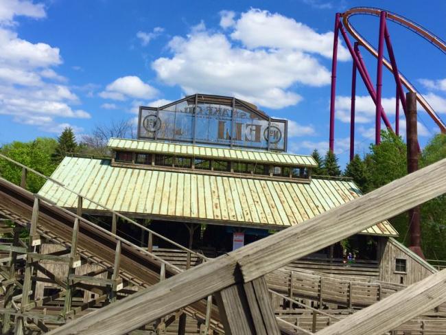
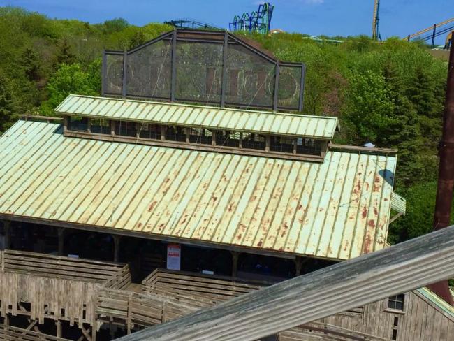
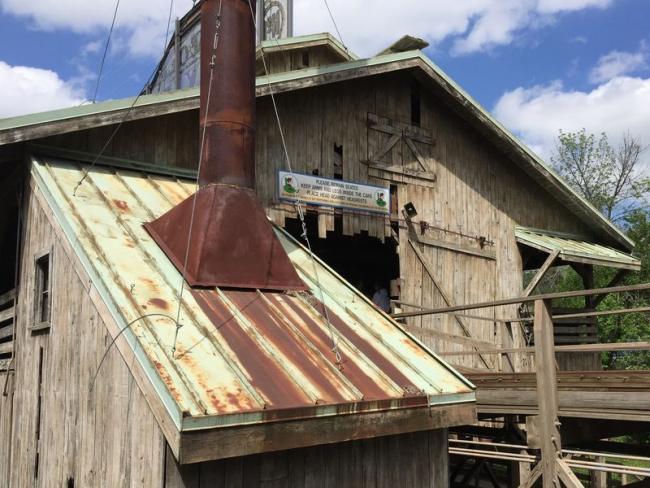
Rather than check for "1800's metal roofs" or figure out what types of metals turn green, I relyed on the research these artists did on this structure. If it's good enough for a theme park, it's good enough for me too!
With that setteled I had to address an intial question...how the heck do I get that faded green color?
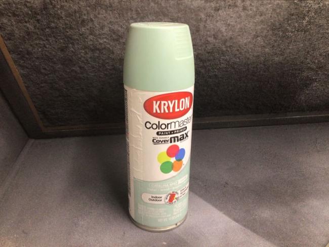
The first step is to find a color that's aready close to the final shade I'm aiming for. It's easier to start there rather than choosing a "realistic" base green and fuss around with fading techniques hoping to get the panels to look bleached out. After trying a variety of greens (all of them too dark) I found one that came pretty close to my pictures: "Catalina Mist" from Krylon.
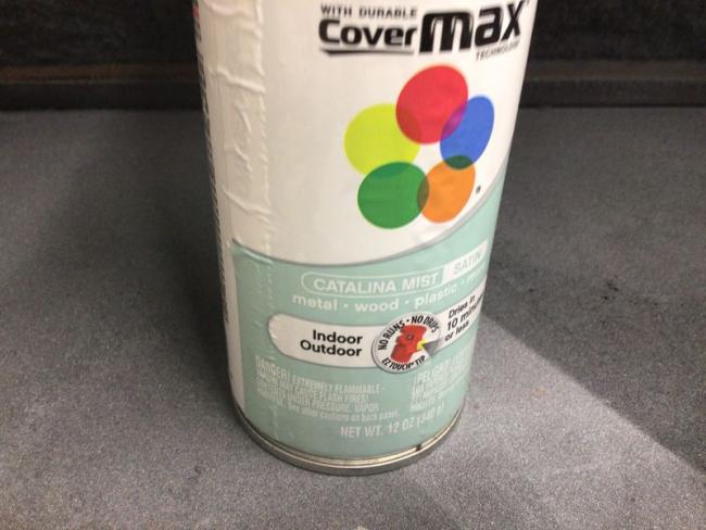
I needed about two or three dozen panels for the roof. After cutting them to size, I gave the pieces some light coats of paint. To add variety, some were painted only with the Catalina Mist. Others were primed first (flat black and dark flat gray), allowed to dry and then hit with layers of Catalina Mist.
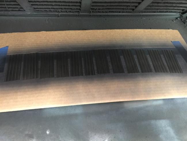
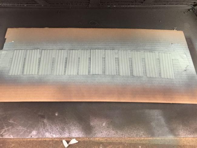
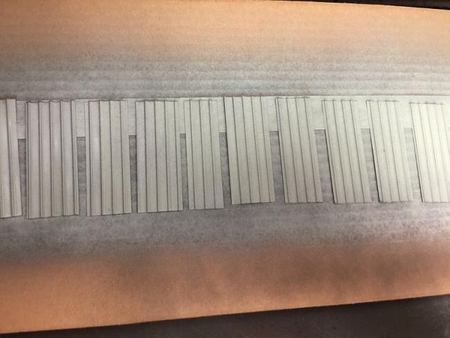
I let all the pieces dry for about 24 hours. Once cured, they were removed from the masking tape and spread onto an old cookie sheet. The sheet was covered with aluminum foil and put into the oven where I baked them for 3 or 4 minutes at 350 degrees. This allows the enamel paint layers to bond completely to the aluminum and makes them resistant to solvents.
That will be important when we pick up with weathering them in the next step.
Bill
My inspiration came from a rollercoaster. "The Viper" is located in the Old West Territory at Six Flags Great America and it features a loading station with an awesome faded green metal roof.


Rather than check for "1800's metal roofs" or figure out what types of metals turn green, I relyed on the research these artists did on this structure. If it's good enough for a theme park, it's good enough for me too!
With that setteled I had to address an intial question...how the heck do I get that faded green color?
The first step is to find a color that's aready close to the final shade I'm aiming for. It's easier to start there rather than choosing a "realistic" base green and fuss around with fading techniques hoping to get the panels to look bleached out. After trying a variety of greens (all of them too dark) I found one that came pretty close to my pictures: "Catalina Mist" from Krylon.


I needed about two or three dozen panels for the roof. After cutting them to size, I gave the pieces some light coats of paint. To add variety, some were painted only with the Catalina Mist. Others were primed first (flat black and dark flat gray), allowed to dry and then hit with layers of Catalina Mist.


I let all the pieces dry for about 24 hours. Once cured, they were removed from the masking tape and spread onto an old cookie sheet. The sheet was covered with aluminum foil and put into the oven where I baked them for 3 or 4 minutes at 350 degrees. This allows the enamel paint layers to bond completely to the aluminum and makes them resistant to solvents.
That will be important when we pick up with weathering them in the next step.
Bill


Comments
Terry
Bill have a friend who told me once trains get in your blood its always there!!
Jerry
As far as baking the panels, I just pop them in the wife's oven. As long as the spray paint is completely dry (24-48 hours) I haven't had any issues. If you put a layer of aluminum foil over the pieces--making sure the foil doesn't make contact with the panels--it reflects the heat evenly. I found a cookie sheet at the Dollar store for...well...one dollar!
Toaster oven is a great idea, too.
Ok, the first step is to add an initial layer of dark rust and corrosion. I use cheap acrylic craft paint (raw umber) applied with pieces of sponge. I dip the sponge piece into the brown and blot most of it off. Then, dab it here and there on the ribs and toward the bottom of the panels.
Different sponges yield different looks depending on how tight the pores are. Just like dry brushing, the most important thing is to blot off almost ALL of the paint.
Pieces of sponge packing material work well. I cut and shape these piesce so they're "round-ish", mostly trying to eliminate the hard edges.
Terry:
For that picture with the chimney and the rust working its way down the panels... I used a medium make-up applicator and experimented with different consistancies of paint. Adding water to thin it down seemd to work best. With a little practice, I was able to get that "scorched" rusty look:
For a heavier rusted effect, additional layers of craft paint can be added. Once each previous application is completely dry, add a lighter color brown. You can see how these add depth and a crusty texture...
I got sort of a "mud splatter" effect on that last panel. But it'll all come together and look corroded rather than muddy. Through trial and error, I realized I needed more panels that looked like the first pictures and only a few looking like the last ones.
Again, it's important to apply water based acrylics in this step. The next application uses mineral spirits to blend chalks and paint. This inital layer of acrylics will remain in place completely unaffected by the application of thinner.
Do you think you should finish the green modulation before the rust? I would think that a darker green wash in the crevices would look realistic.
Perhaps everybody understands modulation. Skip ahead if you do. If not, read on.
In the manuals, when Brett describes how to "create depth" with colors, he's laying out a method of modulation. In military modeling, they discuss modulation but their method usually involves air brushing.
In a nutshell, "modulation" is the color change your eye perceives due to shadows and highlights. It's part of how the brain understands an object's shape, texture, size, distance away (along with other characteristics).
Here's an example.
Think of a blue racquet ball. It's round and made of blue rubber--it's a pure consistent color of blue no matter what part of the ball you look at. So here's a blue racquet ball:
Whadda ya think?
"Ummm, that's not a ball... that's just a blue circle."
Yep. That's because I removed all of the color modulation from my racquet ball picture and your brain saw it as a flat, lifeless blue blob.
But by adding the modulation back in, I've got a chance that your brain will say "I've seen this before...it looks kinda like a racquet ball":
Those different shades of blue provide different and more familiar meaning. It's still a blue circle, but the circle looks fuller. It seems to take up space. It has has volume and depth. We can see there's light reflecting off it and the source is up above. It's blocking some of the light and casting a shadow at the bottom. All of these are subtle cues that confirm to our brain "this is more than a flat blue blob"
If you keep this idea in mind as you build, the same thing happens: A darker tone of chalk added at the bottom of a crate or in the crevices of shelves will complete what our mind expects to "see" if this were real.
I'll tie this concept in (hopefully!) with the next update.
as always, I'll be following you closely.
Jerry
The color modulation process actually began back in step #1 where I primed some of the panels with a dark gray and a some with a flat black. The Krylon color was misted on lightly allowing the gray and black layer to peek through just a bit. If you look again at this photo, hopefully you can see how this step is creating artificial shadows along the ribs and in the valleys:
Terry correctly observed that I was adding "rust" (dabbing the acrylic raw umber) before I had the panel's green color dialed in completely. It seems counterintuitive because in the real world, the panels would dull, fade, and further discolor long before they would show harsh rust spots.
In the next steps, I'll be adding more transparent weathering layers BUT, I'm going to switch from water-based to thinner-based applications. The rust patches (a water-based acrylic paint) will stay in place and remain 100% unaffected by everything I add from this point on. Baking the spray-painted panels has the same effect: those first color applications will be unaffected even by their own thinners.
If that all sounds REALLY confusing, follow allowing and hopefully it'll all make sense.
Here are the materials I used...
-mineral spirits
-Rembrandt chalks, (3 colors): Olive Green 620.3, Raw Umber 408.3 and 408.5
-a selection of brushes: stiff bristle, flat & angled shaders, and a range of rounds:
-And finally (the most important element), an oil paint called "Transparent Orange Iron Oxide".
It's sold at art supply stores but also on Amazon. A tube runs about $12 and will last for years: https://www.amazon.com/M-Graham-Artist-Transparent-Orange/dp/B001JPKPCS/ref=sr_1_1?dchild=1&keywords=Transparent+Orange+Iron+Oxide&qid=1610992531&sr=8-1
(Don't let the words "oil paint" freak you out. This stuff is amazing and has almost NO learning curve. It's the key to creating a believable fade and completing the color modulation.)
The first step is to apply a really fine, light dusting of chalk to the panels. I like to scuff up a chalk stick and then, using a really stiff brush, "scrub" the stick so that the chalk particles are almost as fine as smoke. Keep the coating sparse and the particles tiny.
That illustrates how fine the chalk dust is. Let's try the process on a panel.
First, apply a light, fine chalk layer:
Then, using a pin or toothpick, dab on some relatively thick blotches of the Orange Iron Oxide paint:
With the roof section held at an angle, I FLOOD it with mineral spirits. Starting at the top of the panel, I add spirits and let it run all the way to the bottom. I keep applying spirits so that the chalk dust and paint blotches get wash down and collect at the bottom of the panel:
Some of the chalk will remain on the panel leaving a grungy film. The blotches of oil paint will leave a staining trail of rust. The spirits will also thin the oil and discolor the panel to various degrees of orange giving it a rotten look, without being completely corroded. At this stage, I sometimes allowed the spirits to evaporate and dry and evaluated the appearance. Other times, I used a paper towel to wick away the excess spirits and THEN let it dry:
The final results will vary depending on many factors. More chalk in darker shades, plus more paint yields a more corroded look. In some instances, I dusted on an additional layer of chalk to the pooling spirits:
Obviously, applying minimal chalk and oil paint will look like less corrosion and in a more confined area:
I should point out that I didn't have very good luck using alcohol or A&I to wash the chalk and paint down the panels. I started out ok:
But once the alcohol evaporated, it left some harsh lines behind that looked pretty unrealistic:
Here's a look at the final results:
That last picture is just incredible, the texture, the tonal variations, the reality it conveys is beautiful.
I think what I like the most is the variation from the areas showing the original green roof which is faded and slightly 'stained' by the light rust being washed down the panels all the way to the natural extreme in other areas of the deeply rusted almost black, pure decayed metal that has nothing left to give.
Coloration and texture are absolutely right on for each area in their various stages of decay and degredation, really wonderful work, effects, etc.
Karl and I have discussed corrosion effects that are easily identified as the result of etchant. There’s nothing wrong with that look, but it’s been done quite a bit. And, it doesn’t probably wouldn’t get to that state on a structure that’s still in service.
I like his observation: “almost black, pure decayed metal that has nothing left to give.”
Yep! Any further and it’ll need a patch job.
I’m glad to hear that the explanation made sense because it’s relatively simple.
If you give it a try, please share the results.
Thanks again!
This was a fantastic tutorial. It got me thinking about the different colors copper turns as it ages, So I looked on line to see what I could find. out about copper patina as it ages. Here is on handy chart to show the stages of aging;
jtcroofing.comm.uk/wp-content/uploads/2017/6Copper-patina-colour-chart1.jpg
The chart is interesting and informative. Most of us are looking for our copper roofs to look 25 years or older.
Thanks for getting the juices flowing.
Later, Dave S. Tucson, AZ
I always 'practice' on the bad side to get it right before doing the visible side, somehow my 'bad' side always ends up looking better.
Bill's outstanding technique seems to follow the 4 rules of reproducible, now I jut need to do a build where its required and try to reproduce it.
Dave- that’s a cool graphic on the patina for copper. I knew it discolored quickly but didn’t realize that in under 4 months it barely has any luster left.
When it comes to replicating the effect, I’ll add that I was unsuccessful in pulling it off with regular corrugated panels. The smaller tight grooves didn’t seem to lend themselves to this method and I moved on from them.
However...experimentation and attempts by other modelers could prove me wrong!