Howdy, Stranger!
It looks like you're new here. If you want to get involved, click one of these buttons!
Categories
- 996 All Categories
- 3 Picture Posting and Resizing
- 58 New Member Introductions
- 120 Off-Topic Forum
- 4 Photography
- 2 Resources
- 18 New Product Information
- 170 The SierraWest Forum
- 10 Brett's Blog
- 121 General News & Ramblings
- 3 Re-Release Information
- 6 Q & A about SierraWest
- 9 What Would You Like to See?
- 408 Builds
- 145 HO Scale Builds
- 180 O Scale Builds
- 62 Finished SW Build Pics
- 15 Miscellaneous Builds
- 195 Techniques
- 19 Working with Wood
- 23 Painting Castings
- 5 Masonry
- 23 Scenery
- 37 Tools and Supplies
- 22 Layout Planning & Building
- 40 Miscellaneous
- 24 Prototype Information
- 22 Reference and Research
HO Morton's Brass & Iron Foundry Build
Well here we go. After asking which kit I should do next, Ken had suggested this kit and I realized this kit was purchased by my wife as a birthday gift last October. I think it prudent I do it next for the last reason.
I will follow the instructions pretty closely, but I have a few ideas for some minor deviations to make it my unique build. That said, I would love suggestions from those familiar with the kit of things you might like to see added or modified.
I have been asked to build a couple handlaid custom On30 curved turnouts for a close friend and another asked me to build some O scale Westside Lumber kits. These will slow me down a bit, but my focus will be this kit.
So, I'm off.
The most important part of this kit.
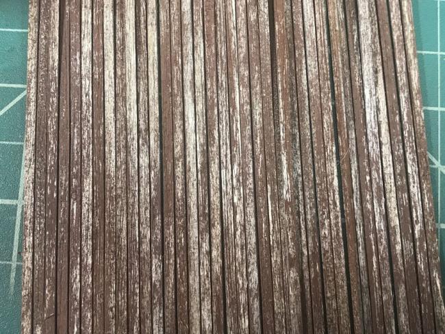
Of course we start with graining, knotting and staining wood for the pattern shop.
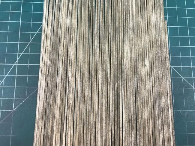
I did deviate slightly by using the mineral spirit method instead of the damp brush for the walls. The camera lightened the photo. It is actually darker than it appears here.
So it has begun.
Rick
I will follow the instructions pretty closely, but I have a few ideas for some minor deviations to make it my unique build. That said, I would love suggestions from those familiar with the kit of things you might like to see added or modified.
I have been asked to build a couple handlaid custom On30 curved turnouts for a close friend and another asked me to build some O scale Westside Lumber kits. These will slow me down a bit, but my focus will be this kit.
So, I'm off.
The most important part of this kit.

Of course we start with graining, knotting and staining wood for the pattern shop.

I did deviate slightly by using the mineral spirit method instead of the damp brush for the walls. The camera lightened the photo. It is actually darker than it appears here.

So it has begun.
Rick


Comments
Nicely executed. Looking forward to seeing the four walls and roof come together and some additional photos. If this start is indicative of what is to come it should be an outstanding build indeed.
Later, Dave S. Tucson, AZ
Comments and suggestions please.
The gooseneck lamps are operational as well as one inside light.
I am surprised no one familiar with the kit called out the change in the door in the right wall. The instructions called for the rollup door. I opted to swap that with the repair shed doors as that will be in the front from the main viewing direction, especially when installed on the layout. Brett made both doors exactly the same size making the swap super easy.
On to the repair shed.....Rick
He models On30.
Rick
I'm not sure what I want in the interior yet. Suggestions welcome.
Rick
Will you still consider this to be the Repair Shop? If so, do you have any light machinery laying around? Workbench with grinder, drill press, table saw, etc. Those would look right at home. Some shelving along the left wall looking through the door might look good.
How is the open framing going to look through the door? Will you want to cover that section of wall?
I added a few items on the blank top then installed the finished shelving.
I wanted things to see through the windows and door. It will be lit, but the roof will not be removable. Here are the results so far. I need to get the lighting in then do the roof. Of course there is more to go on the porch yet too.
Suggestions and comments always welcome. Rick
I also have finished the lighting. Kevin, I had the gooseneck over the repair shop door fail (probably my fault) after I had glued down the roof. What a pain to pry the roof back off without damage and change out the lamp. I did bump a couple of the stacks on the roof and had to redo them too.
Here is what the lighting looks like so far.
Of course, more details will be added to the docks, decks and surroundings as well as more finished weathering after the buildings are in place.
Guys, school is back in session which signals the start of modeling season. Let's get it on....Rick